A memorial website is often created at a difficult moment, but its value continues long after the first arrangements have been made. Good Remembrance Website Design gives a family somewhere calm to gather photographs, stories, dates, and messages without asking every visitor to remember in the same way. Some people want to write a long tribute; others may only have one photograph or a small detail to add. A thoughtful online space welcomes all of those contributions.
The strongest memorial websites do more than store information. They create a gentle rhythm for returning. A page can hold a birthday memory, a favourite saying, a recipe, or the story behind an ordinary object. Over time, these details form a fuller and more human picture of a life. The design should make that process feel natural, private where necessary, and easy for relatives of different ages and technical abilities to use.
Start with the memories people are ready to share
Families rarely arrive with a complete archive. In the early days, they may have a service reading, a handful of portraits, and a few messages from close friends. Months later, someone may discover a box of letters or remember a story that has not been told for years. Memorial Web Design should leave room for this gradual unfolding rather than presenting a finished biography as the only acceptable outcome.
A clear starting point might include a short life story, a gallery, and a simple invitation to contribute. Each section can be distinct without feeling fragmented. A visitor should understand where to read, where to leave a message, and how to find important dates. When the structure is reassuring, people can concentrate on what they want to say instead of working out how the website works.
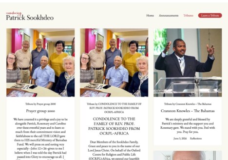
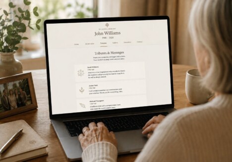
This is also where a flexible tribute structure helps. Short memories, longer recollections, and family photographs can sit alongside one another without competing for attention. The design gives every contribution a place while allowing the collection to grow in its own time.
Give everyday details the same care as milestones
Important anniversaries and major achievements naturally belong on a memorial website, but they are only part of a person’s story. A favourite walk, a habit at breakfast, a particular laugh, or the way someone welcomed guests may be what relatives most want to keep close. These everyday details make a tribute recognisable. They help a grandchild who never met the person understand not only what happened in a life, but what it felt like to be around them.
Remembrance Website Design can support this by using simple, inviting categories. A page for “small moments” might sit beside a timeline, while a gallery can include captions that explain the people and places in each image. Captions are especially valuable because photographs lose context as generations pass. A few careful words can turn an unfamiliar image into an open door for conversation.
It is worth considering how content will be read on a phone as well as a larger screen. A relative may visit while travelling to a gathering, or may return to one message late at night. Comfortable type, generous spacing, meaningful headings, and image layouts that do not require awkward pinching all make the experience more considerate. Accessibility is part of remembrance: every visitor should have a fair chance to take part.
Design for returning visitors, not just the first visit
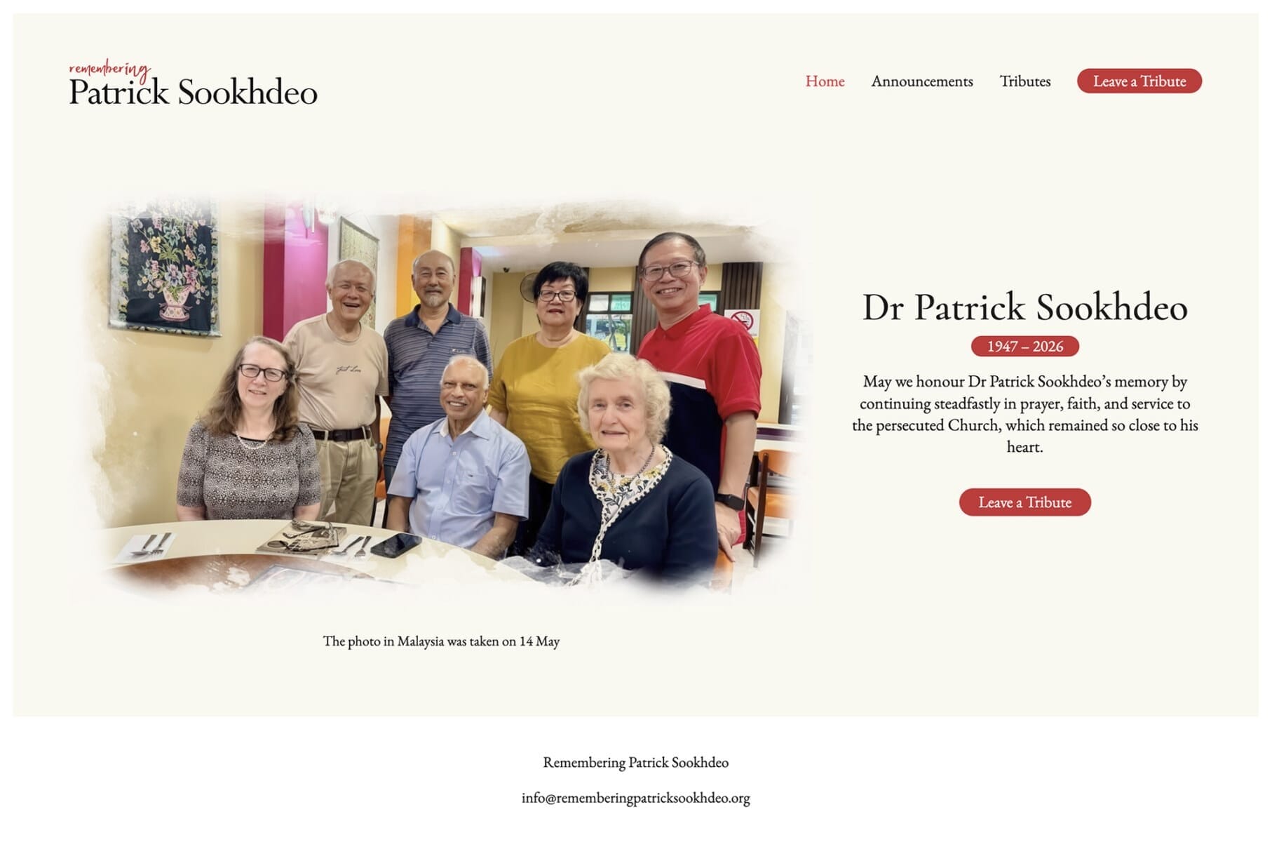
A memorial website often becomes most meaningful through repetition. People return on a birthday, during a difficult week, when a new child joins the family, or simply because they want to feel connected. The homepage should therefore offer a gentle sense of orientation. A recent message, a prominent photograph, or a small “remembering today” feature can provide a fresh point of entry without changing the character of the whole site.
Navigation should remain stable. Visitors should not have to search for the story, the gallery, or the guestbook each time they arrive. A consistent menu and recognisable page titles quietly communicate that the site is cared for. If the website includes private areas, those boundaries should be explained in plain language so contributors know what will be visible before they submit anything.
Families may also appreciate a design that makes future additions feel possible. A page does not need to announce every feature at launch, but it can allow space for a new gallery, an anniversary note, or a collection of memories from a particular group of friends. This approach echoes the value of a memorial website that grows over time: the archive is allowed to remain alive rather than becoming a static monument.
Make sharing feel safe and personal
Inviting contributions is a practical design decision as much as an emotional one. Some people will be confident writers; others may worry about saying the wrong thing. A welcoming form can use a short prompt, explain what happens next, and make optional fields genuinely optional. The tone around the form matters too. “Share a memory when you are ready” feels very different from a demand for a polished tribute.
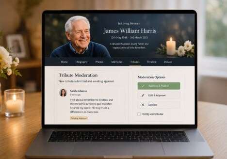
Privacy deserves equal attention. Families should decide whether a message is public, visible only to invited people, or reviewed before it appears. Image permissions and contact details should be handled carefully, especially when children or vulnerable relatives are pictured. Clear controls build trust and help people contribute with greater confidence.
It can also be useful to provide a way to save or print selected memories for a family archive. A digital memorial should not trap a family’s history inside one interface. Thoughtful attention to quiet details includes making important stories easy to revisit, download, or carry into a future family gathering.
Let the visual language reflect the person
There is no single correct style for a memorial website. A quiet neutral palette may suit one family, while another may prefer a favourite colour, a landscape, or a more expressive collection of images. The aim is not to make the site sombre by default. It is to create visual choices that feel connected to the person being remembered and comfortable for the people who will use the website.
Photography, typography, and spacing should work together rather than turning the page into a display of effects. A meaningful portrait can have room to breathe. A handwritten quotation might be used sparingly as an accent, while body text remains clear and readable. Motion should never distract from a story or make the page tiring to navigate. Restraint often gives emotion more space.
A lasting place shaped by many voices
The best memorial websites are not defined by how much content they launch with. They are defined by how naturally they let a family keep remembering. When the structure is clear, the tone is gentle, and the practical details are considered, people can add their own perspective without feeling that they are interrupting someone else’s story.
That is the real promise of considered Memorial Web Design: a digital place that remains open to discovery. It can hold the formal account of a life and the small, surprising memories that make that account personal. As new stories arrive, the website becomes not only a record of the past, but a shared way for a family to stay connected in the present.