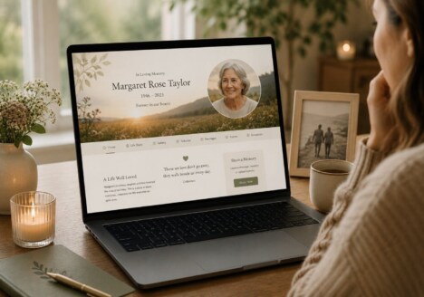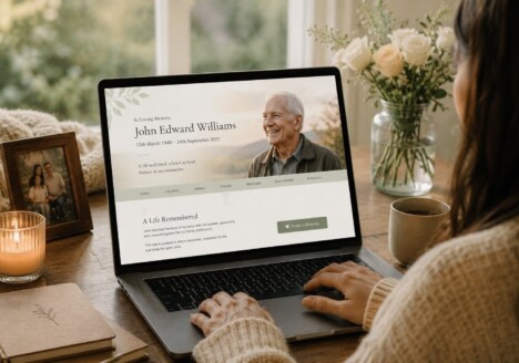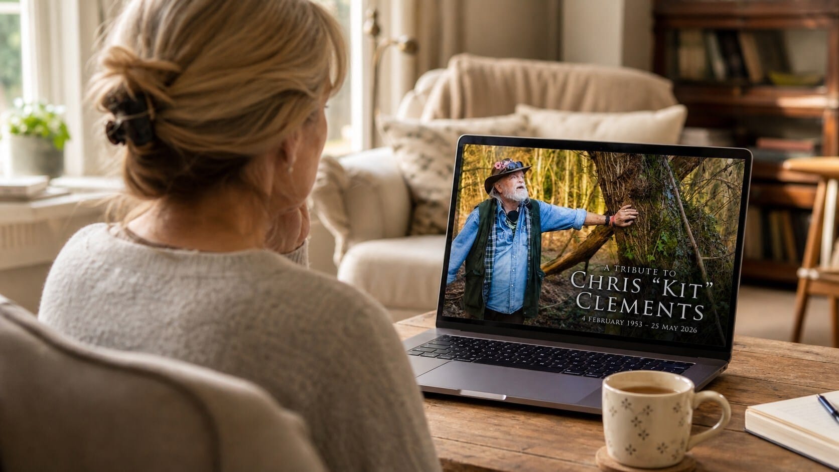
A memorial website is often visited in different moods and for different reasons. Someone may arrive looking for a photograph, a familiar story, or a place to leave a few words. Another visitor may be discovering details they never knew before. Good Remembrance Website Design makes room for all of those visits without asking people to navigate a complicated archive or understand a rigid timeline. It creates a calm digital space where memory can be encountered at a natural pace.
Begin with the shape of a life, not a list of features
The strongest memorial sites start with the person being remembered rather than with a collection of web components. Before choosing layouts, it helps to think about the qualities that made the individual recognisable: a love of music, a generous habit of hosting friends, a career built around helping others, or the small routines that made a household feel like home. Those details give the design a sense of direction. Colour, imagery, wording and spacing can then support a character instead of producing a generic memorial template.
This approach also helps families decide what belongs on the opening screen. A short welcome, a favourite photograph and a few carefully chosen lines may say more than a dense biography. Visitors should understand quickly whose story they are entering, while still feeling invited to explore. A restrained introduction can lead to longer memories, a gallery, a tribute book or a collection of milestones without making the first view feel overwhelming.
Thoughtful Memorial Web Design treats the visual identity of the site as part of the remembrance itself. A warm neutral palette may suit a quiet, reflective story; brighter colours might be right for someone remembered through humour, travel and lively gatherings. The important decision is not whether a style is fashionable, but whether it feels honest to the family.
Make returning to a memory feel effortless
People rarely experience grief in a straight line, and they do not use a memorial website in a straight line either. A visitor may read a page in full one day and only look at one image months later. Clear navigation, readable typography and generous spacing make those returns easier. Sections should have meaningful names, links should be easy to recognise, and important memories should not be hidden behind layers of menus.
It is useful to organise content around the ways people actually remember. A page for everyday moments can sit alongside a life story, a photo collection, a guestbook and a section for anniversaries. The structure does not have to be exhaustive at launch. A simple foundation can grow as relatives find letters, scan albums or remember another story during a conversation. This is why a Remembrance Website should be designed for gradual discovery rather than a single, final upload.
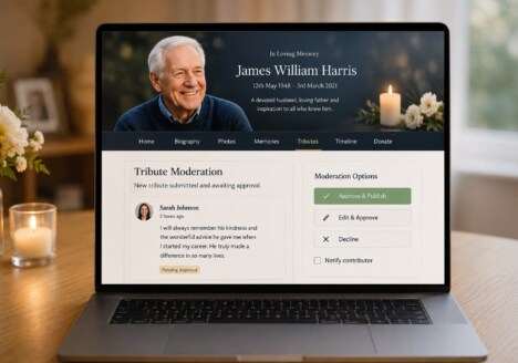
Small interaction choices matter as well. Captions can provide context without competing with photographs. A tribute form can offer prompts for people who want to contribute but do not know how to begin. If comments or submissions are enabled, moderation and privacy should be considered from the start, so the family remains comfortable with how the shared space develops.
Give every contributor a comfortable way to belong
Families do not all remember in the same voice. One person may write a detailed account; another may contribute a sentence, a recipe, a recording or a photograph. A memorial website becomes more welcoming when it treats those differences as valuable rather than expecting everyone to produce polished prose. Clear contribution guidance, optional prompts and a gentle tone can help more people take part.
Accessibility is part of that welcome. Text should remain legible on a phone, colour contrast should support older visitors, and images should have useful descriptions for people using assistive technology. Pages should load without unnecessary movement or decorative clutter. These decisions are practical, but they also carry emotional weight: they show that the site has been made with the whole family in mind.
Privacy deserves equal care. Families may want a public tribute, a private archive, or a mixture of open and protected sections. The design should make those boundaries understandable, particularly when photographs, addresses, recordings or personal stories are involved. A clear process for adding, correcting or removing material gives the family confidence that the memorial can remain respectful as it grows.
Let the website grow with remembrance
A memorial website should not imply that one launch date can contain an entire life. New memories often arrive after the funeral, after an anniversary, or during an ordinary conversation when someone suddenly recalls a detail worth saving. A flexible structure allows those additions to feel like part of the story rather than awkward amendments.
Families can plan gentle reasons to return: a birthday reflection, a seasonal photograph, a page about a favourite place, or a collection of messages on an anniversary. These updates do not need to be frequent or formal. Their value comes from keeping the connection active and giving different generations a way to add what they remember. As the site develops, it can become a shared record of both the life that was lived and the relationships that continue.
The best memorial web design is therefore quiet in its ambition. It does not compete with the memories or turn grief into a performance. It offers a dependable place to pause, learn, contribute and return. When the layout is shaped around a real person and the needs of the people who love them, the website becomes more than an archive: it becomes a thoughtful part of how a family keeps telling the story.