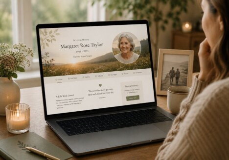
A remembrance website is often imagined as a collection of photographs and dates. Those things matter, but they are only the visible beginning of a much richer story. The most meaningful memorial spaces also hold the small details that might otherwise fade: the phrase someone always used, the route they walked every morning, the recipes they made without measuring, or the way a room felt when they were in it. Thoughtful Remembrance Website Design gives those details somewhere to live, so a family can return to them in its own time.
Begin with the shape of a real life
Every person is remembered through a different pattern of moments. For one family, that pattern may centre on photographs from childhood, work and holidays. For another, it may be built from music, handwritten notes, favourite sayings and stories gathered from friends. A memorial website should not force all of those memories into the same template. Its structure should be flexible enough to reflect a full personality rather than reducing a life to a short biography.
This is where good planning makes a difference. Before choosing colours or arranging a gallery, it helps to think about the questions visitors will naturally bring with them. What did this person care about? What did they teach others? Which moments show their humour, their kindness or their determination? Organising content around those questions creates a more human experience and gives contributors a clear sense of what they might add.
A calm introduction can provide essential context, while separate areas for stories, photographs, milestones and messages allow visitors to explore without feeling overwhelmed. The aim is not to include everything on one screen. It is to create an inviting path through the material, with enough breathing space for each memory to be appreciated.
Make room for memories that arrive later
Grief does not follow a publishing schedule. A story may surface months after a funeral because someone finds an old letter, speaks to a former colleague or suddenly remembers an ordinary afternoon in vivid detail. A memorial website becomes more valuable when it welcomes those later discoveries instead of treating the first publication as a finished archive.
That means the design should make additions feel simple and safe. Clear prompts can invite family members to share a memory, upload a photograph or add a note for a meaningful anniversary. Visitors should understand what is being requested, where their contribution will appear and whether it will be reviewed before it becomes visible. Small practical decisions like these help more people participate, including those who may not feel confident using a website.
The best online memorials also recognise that people return for different reasons. Someone may want to read a long tribute; someone else may only have a minute to look at a familiar photograph. A considered Memorial Web Design approach supports both kinds of visit through readable typography, clear navigation and layouts that work equally well on a phone, tablet or computer.
For ideas about building a space around shared participation, this memorial website guide explores how memories can keep opening new doors. It is a useful reminder that an archive can remain active without becoming noisy or complicated.
Use design to support reflection
Visual choices carry emotional weight. A crowded layout, dramatic animation or overly bright colour palette can compete with the very memories the website is meant to honour. Gentle contrast, generous spacing and a restrained set of colours usually create a more appropriate setting. This does not mean the design has to be plain. It can still express the person through a favourite colour, a landscape, a meaningful pattern or carefully selected images, but those choices should support the story rather than decorate it.
Photography deserves particular care. A gallery can be arranged chronologically, thematically or as a sequence of meaningful places, depending on what best reflects the family’s experience. Captions can add context without turning every image into a formal record. Where possible, descriptive alternative text also helps visitors who use assistive technology share in the archive, while captions and transcripts can make video or audio contributions easier to understand.
Reflection also depends on performance and accessibility. Pages should load quickly enough that a visitor is not left waiting during an emotional moment. Text should remain comfortable to read, buttons should be easy to tap, and links should describe where they lead. These are practical details, but they communicate care: the website has been made for real people, with different devices, ages and abilities.
Connect the personal story with the wider family
A memorial website can become a bridge between people who knew the same person in different ways. A school friend may remember a generosity that a colleague never saw. A grandchild may discover that a favourite hobby was shared across several generations. Giving those voices room creates a fuller, more honest portrait and helps visitors recognise connections between their own memories.
Internal links can gently guide readers between related parts of that wider story. For example, a passage about family traditions might lead to a reflection on making a home for shared stories, while a section about everyday photographs could point towards ideas for keeping ordinary memories close. Used naturally, these links help visitors discover related thoughts without interrupting the emotional flow.
Most importantly, a remembrance website should feel true to the person it represents. It does not need to imitate a social network or become an exhaustive database. It needs a clear purpose, a thoughtful structure and a welcoming way for people to contribute. When Remembrance Website Design pays attention to both the significant milestones and the quiet details, the result is more than an online notice. It becomes a living place where a family can remember, add to the story and find one another again.