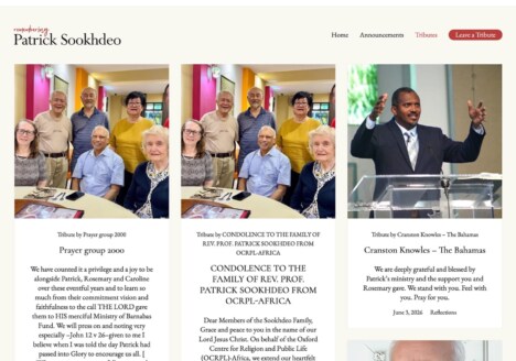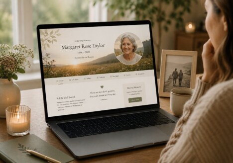
A remembrance website is rarely visited only once. Families may return on a birthday, an anniversary, a quiet Sunday afternoon or a day when a familiar song brings someone to mind. That changes the role of the website. It is not simply an announcement or a digital noticeboard created at one particular moment; it becomes a gentle place that can meet people at different stages of remembering. Thoughtful remembrance website design makes room for those changing visits, giving memories enough space to remain personal, useful and open to new contributions.
Designing for the first visit and the visits that follow
The first visit to a memorial website can carry a lot of emotion. Visitors may be looking for a service detail, a photograph, a funeral notice or a way to leave a message. Clear navigation matters because people should not have to work out where important information has been placed. A calm introduction, a recognisable portrait and a small number of well-labelled sections can help visitors find their way without making the experience feel clinical.
Later visits have a different purpose. Someone may want to read a story again, look through photographs with a child, or add a memory that was not ready to be shared earlier. A good structure supports both kinds of use. It might place the person’s life story, gallery, tribute messages and practical information in separate but connected areas. This keeps the opening page welcoming while allowing the website to become richer over time. The aim is not to add every possible feature, but to make each return feel familiar and easy.
Families planning content can also find inspiration in this guide to designing a memorial website for the connections that remain. It is a useful reminder that a website can acknowledge the relationships around a person without losing sight of the individual life being remembered.
Giving everyday memories the same care as milestones
Many memorials naturally focus on major events: a career, a wedding, a memorable journey or an important achievement. Those details matter, but everyday memories often make a person feel most present. A favourite phrase, the way they made tea, a familiar garden, a treasured recipe or a story that was told at every family gathering can say just as much about their character.
Memorial web design can support these details by using flexible content areas rather than forcing every contribution into a formal biography. Short recollections, longer stories, scanned letters and small collections of photographs can sit alongside one another. Captions and dates help provide context, while generous spacing makes the page easier to read. Visitors should be able to pause over a memory instead of being confronted by a dense wall of text.
This is also where a considered visual style becomes important. Colours, typography and imagery should create a sense of warmth without competing with the content. A restrained palette, readable type and carefully chosen image proportions can help the website feel distinctive to the family while remaining comfortable to visit. The design should support the voice of the memories, not impose a mood that feels separate from them.
For more ideas about preserving the small details people return to, see this approach to memorial website design for everyday moments. It shows how ordinary experiences can become a meaningful part of a lasting tribute.
Making participation feel natural and unpressured
A shared remembrance website works best when contribution feels optional and welcoming. Not everyone will write in the same way. One visitor may upload several photographs, another may leave two sentences, and someone else may prefer to read quietly. The design should give all of these responses equal dignity. Clear prompts can explain how to contribute, but they should never make visitors feel that they are expected to produce a polished piece of writing.
It can help to create a few simple invitations, such as “share a memory”, “add a photograph” or “tell us about a favourite place”. These prompts give people a starting point while leaving the content open. If submissions are moderated, a short explanation of the process can reassure contributors that their words will be handled with care. Accessibility is part of this welcome too: good contrast, logical headings, descriptive links and a layout that works on a phone allow more family members to take part.
Over time, these contributions can form a living record of how a person was known and loved. The website does not need to be constantly updated to be valuable. Even a small addition made months later can create a new reason to visit, and a quiet archive can still feel active because it holds the possibility of discovery.
Creating a lasting digital place with room to breathe
The strongest remembrance website designs balance continuity with restraint. They preserve important words and images, but they also leave enough breathing space for visitors to reflect. They make practical information easy to find, while allowing the deeper story to unfold gradually. They recognise that remembrance is not a single event and that different people will need different things from the same online place.
A thoughtful memorial website can therefore become part of a family’s ongoing rhythm: a place to visit on significant dates, a resource for younger relatives learning family history, and a quiet home for stories that might otherwise be forgotten. By designing for return visits, everyday details and varied forms of participation, the website can remain useful and emotionally honest long after it is first published.
Families considering how to keep a tribute welcoming for everyone may also find value in this remembrance website design focused on bringing people together. The central principle is simple: give memories a clear, respectful place, then let each visitor spend time there in their own way.