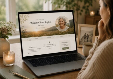
Remembrance is rarely a single story told in a single sitting. Families often discover meaning gradually: in a photograph found at the back of a drawer, a recipe remembered by one relative, or a small detail that suddenly explains a much larger part of someone’s life. Thoughtful remembrance website design makes room for that gradual process. It gives people a calm, dependable place to gather what they know now while leaving space for the memories that will emerge later.
A memorial website can be more than an online notice or a fixed collection of dates. It can become a shared family space where stories, photographs, messages and personal history sit together with care. The design should support reflection without making the experience feel formal or difficult. Clear navigation, generous spacing and a gentle visual rhythm help visitors spend time with the content rather than trying to work out how the website works.
Begin with the memories that are easiest to share
When a family first creates a remembrance website, the most important material is not always the most dramatic. Everyday memories can be the easiest starting point: a favourite walk, a familiar saying, a much-loved meal or the place where someone always chose to sit. These details invite contributions because they do not require a polished biography. A good design makes it simple to add a short story, upload a photograph or return later to expand a thought.
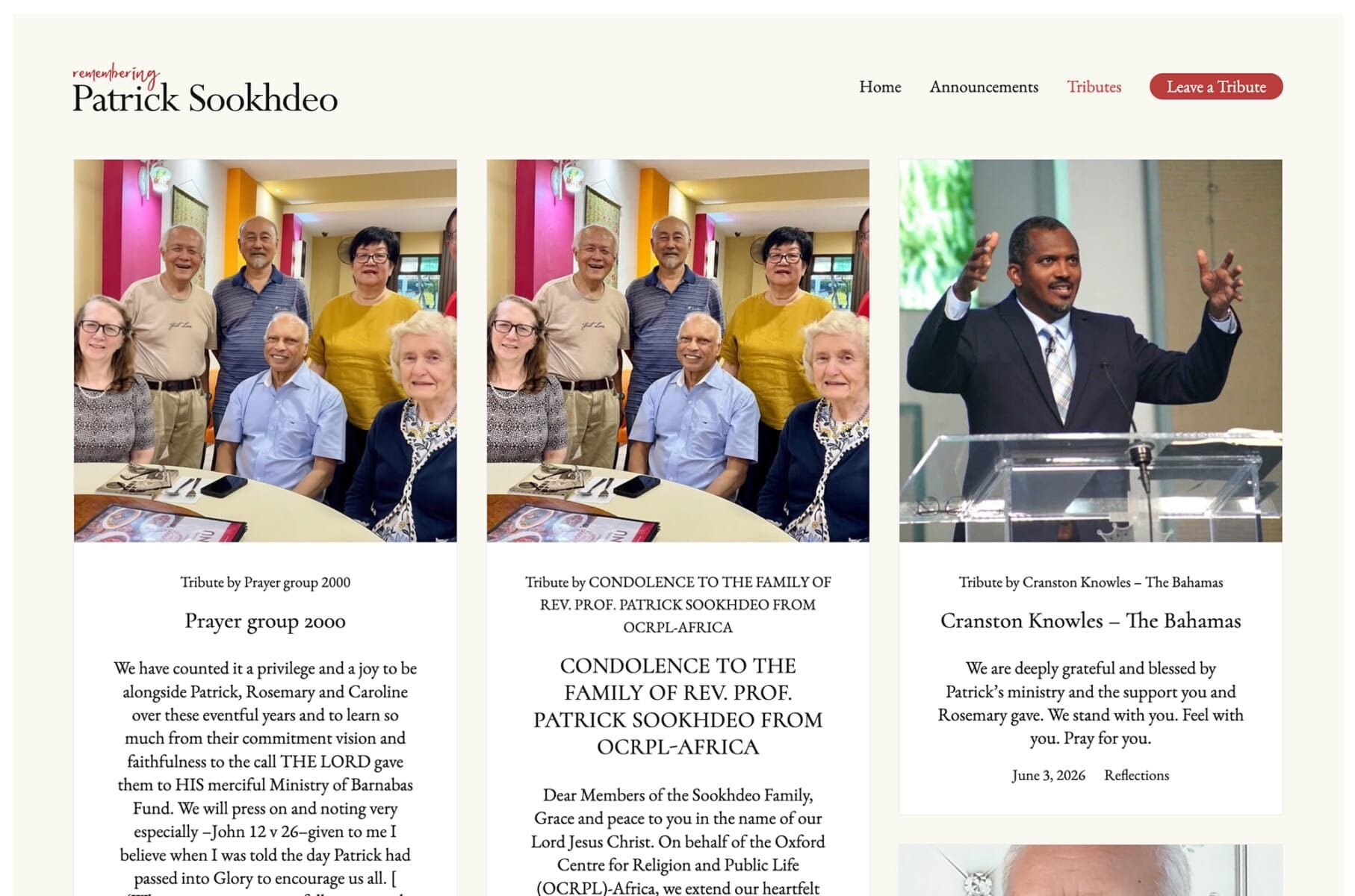
This is where a carefully planned memorial website for small family stories can feel especially valuable. The layout can give equal dignity to a few lines and a longer recollection, so visitors do not feel that only complete, perfectly written memories belong. Short entries can be arranged as a growing collection, helping the site reflect the real way remembrance develops over time.
Practical details matter as well. Upload controls should be understandable, forms should work well on a phone and the page should make it obvious where a contribution will appear. If several family members are taking part, gentle prompts can help them remember what to share without telling them what their memories should mean. The best memorial web design supports different voices while keeping the overall experience coherent.
Create a structure that can grow with a family
A useful remembrance website needs enough structure to remain easy to explore as more material is added. A simple timeline might hold significant dates, while separate areas can collect photographs, written tributes, music, places and messages from visitors. The goal is not to create a complicated archive. It is to give each type of memory a natural home, with navigation that remains reassuring even when the collection becomes substantial.
Families should also be able to revisit older content without feeling that the website belongs only to the moment it was created. A considered approach to remembrance website design between milestones can connect birthdays, anniversaries, holidays and ordinary days. These returning points help a memorial website remain part of family life, rather than becoming a page that is visited only once and then left behind.
Good content organisation protects the emotional quality of the experience. Descriptive headings, meaningful captions and consistent image presentation help visitors understand what they are seeing. Search-friendly wording can help relatives find the site again, but it should never overwhelm the personal tone. The design should feel human first: quiet, legible and respectful of the different reasons people may arrive.
Make room for different ways of remembering
Not everyone remembers through the same medium. One person may write several paragraphs, another may contribute a single photograph, and someone else may prefer to leave a brief message on an anniversary. A memorial website should welcome these differences. Flexible content blocks, accessible typography and a layout that works across screen sizes allow participation without requiring everyone to behave like an author.
The visual language can help establish that welcome. Soft contrast, restrained colour and carefully chosen type can create warmth without turning the website into a decorative display. Photographs deserve enough space to be seen clearly, while text needs comfortable line lengths and generous margins. These choices are small on their own, but together they communicate that every contribution has been given time and attention.
It is also worth considering how private or public each part of the website should be. Some families may want a public tribute, while others may prefer a quieter space shared only with invited relatives. Clear explanations about contributions, moderation and contact options build confidence. A well-made memorial website shaped around family remembrance can offer both openness and boundaries, allowing people to take part in a way that feels right for them.
Let the website become a lasting place of connection
The most meaningful remembrance websites do not try to say everything at once. They provide a foundation that families can return to, add to and care for together. Over time, the collection may include stories that were almost forgotten, photographs that had been kept in separate homes and messages from people who could not be present in person. The website becomes valuable because it keeps making room.
That is the central purpose of thoughtful remembrance website design: not simply to present a finished tribute, but to create a lasting setting for connection. When the structure is calm, the technology is dependable and the visual choices are respectful, families can focus on what matters most. Every new memory can arrive in its own time, joining the others as part of a living record of a life and the people who continue to remember it.