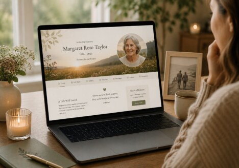
A thoughtful remembrance website does more than collect information in one place. It gives a family a calm, welcoming space where memories can be shared at the pace that feels right. Good Remembrance Website Design recognises that people will arrive with different needs: someone may want to read a life story, another person may be looking for a photograph, and someone else may simply need a quiet moment with a familiar name.
That is why memorial web design should feel personal without becoming difficult to use. The layout, language, imagery and navigation all need to support remembrance rather than compete with it. When the experience is considered carefully, a website can become a gentle meeting place for relatives and friends, whether they live nearby or across the world.
Begin with the life behind the website
The strongest memorial websites begin with the individual, not with a template. Before deciding on colours or page sections, it helps to gather the details that made the person recognisable in everyday life: the places they loved, the phrases they used, the work they were proud of, the music they played, and the small habits that family members still notice in their own lives.
These details create a richer foundation than a short formal biography alone. A remembrance website might introduce the main story with a concise overview, then give visitors different routes into the memories. One section could hold a timeline of important moments, while another could explore family life, friendships, interests or community work. This structure lets visitors choose what they want to discover without turning the whole story into a single long page.
It is also worth allowing room for uncertainty and additions. Families often remember more as conversations continue. A flexible memorial website built around the ways families remember can be updated with a newly found photograph, a story from a former colleague or a detail that had been overlooked during the first weeks of planning.
Make sharing memories feel natural
People contribute to a memorial in different ways. Some will write a considered tribute, while others may prefer to upload a photograph, leave a short message or share a memory privately with the family first. The design should make these contributions feel possible without making visitors learn a complicated system.
Clear prompts can help. A page might invite people to share a favourite moment, describe a place they visited together or add a photograph with a sentence of context. These simple starting points often produce more personal responses than a generic request to “leave a message”. The website can also explain how contributions are reviewed, giving families control over what is displayed while keeping the invitation warm and open.
Good navigation matters here. A visitor should be able to move from the main story to a gallery, tribute page or memory timeline without losing their place. On mobile devices, generous spacing and readable text are especially important because many people will visit from a phone while travelling, attending a service or sitting with relatives. Accessibility is part of the emotional welcome: captions, descriptive link text, strong contrast and sensible heading structure help everyone take part.
For families with many contributors, a remembrance website that brings people together can also create a shared rhythm. It gives relatives a common place to return to, while still leaving room for each person’s voice and relationship with the person remembered.
Use visual choices that carry meaning
Photography is often the emotional centre of a memorial website, but it works best when it is given space to breathe. A small selection of meaningful images can say more than a crowded gallery. Images might be grouped by period, place or theme, with short captions that explain why a moment matters. This makes the photographs easier to understand for people who did not know every chapter of the person’s life.
Colour and typography should support that same sense of care. A restrained palette can reflect the character of the person or the atmosphere the family wants to create, while a distinctive accent colour may help important links and dates remain easy to find. Typography should be comfortable for longer reading, with headings that provide a clear path through the story and paragraphs that do not become tiring on smaller screens.
There is no single correct mood for memorial web design. Some families may want a quiet, minimal presentation; others may prefer something brighter that reflects humour, energy or a love of colour. The important thing is that the choices feel connected to the life being remembered. A remembrance website for the quiet details that matter can be understated and still feel deeply individual when the details have been chosen with intention.
Design for the memories still to come
A memorial website should not be treated as finished on the day it launches. Anniversaries, birthdays and family gatherings may bring new stories, while old friends may discover the site months or years later and offer a memory no one else knew. Planning for this ongoing life makes the website more useful and more truthful.
That may mean adding an archive for new photographs, a page for annual messages or a simple way to revisit important dates. It can also mean reviewing links, checking that the site remains easy to read and deciding together who will care for the content over time. With thoughtful planning, a remembrance website becomes more than a digital announcement. It becomes a living record of connection: a place where a person’s story can keep welcoming people back, one memory at a time.