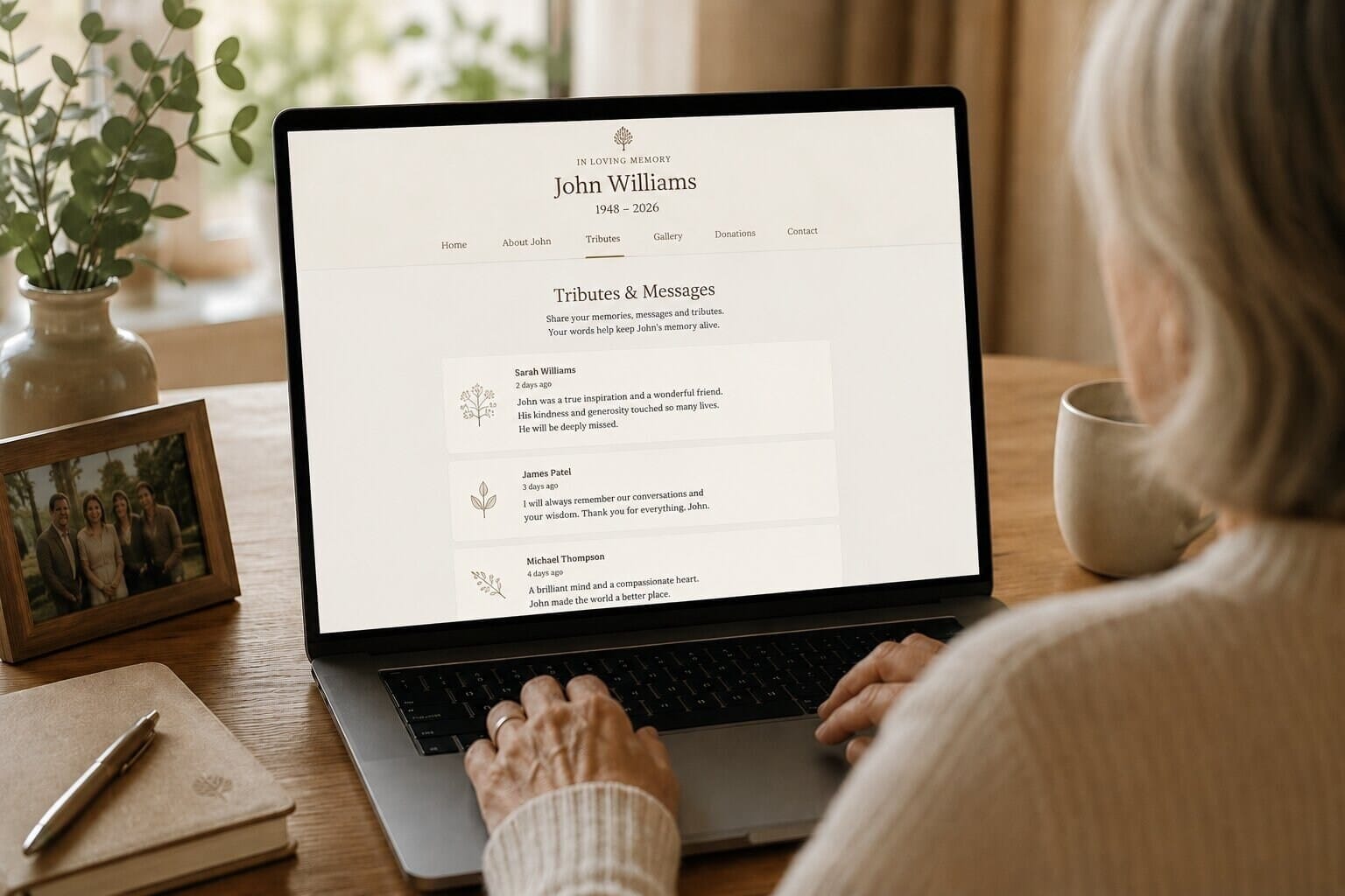
A remembrance website is not only a place to collect photographs after a loss. It can become a thoughtful, living record of the person behind those photographs: the habits that made people smile, the phrases relatives still repeat, the places that shaped a childhood, and the small stories that might otherwise disappear between generations. Good remembrance website design gives all of those details room to sit together without making the experience feel crowded or formal.
Families often begin with a practical need. They want one reliable place for an order of service, funeral information, a condolence message, or a gallery that can be shared with people who cannot attend. Over time, the purpose grows. A visitor may return on a birthday, an anniversary, or an ordinary afternoon when a familiar memory suddenly feels close. A well-planned memorial web design supports that changing relationship with care, clarity and warmth.
Start with the memories people will want to find again
The strongest memorial websites are organised around real acts of remembering rather than around a long list of features. Before choosing colours or page layouts, it helps to ask what relatives will come looking for. One person may want to read a favourite story. Another may want to see family photographs from a particular decade. Someone else may want to leave a short message, add a memory, or find details about an upcoming gathering.
This is where a clear content structure makes a meaningful difference. Sections such as “About their life”, “Family memories”, “Photographs”, “Messages” and “Dates to remember” give visitors a gentle sense of direction. They can browse at their own pace, while the site remains flexible enough to grow. A simple navigation menu is especially important for older relatives or visitors using a phone, because the emotional purpose of the visit should never be obscured by complicated interaction.
A page about everyday moments can be just as valuable as a formal biography. The first job, the Sunday routine, a favourite meal, a well-worn garden chair or an unforgettable holiday can reveal personality more vividly than a timeline alone. When the design treats these details as meaningful, a remembrance website for stories carried forward starts to feel personal rather than generic.
Make room for different voices and different kinds of tribute
No family remembers in exactly the same way. Some people write long reflections, while others contribute a sentence, a photograph or a memory that has been told aloud for years. A considerate website should welcome those differences. It can use a mixture of editorially written sections, short quotations, captions, audio memories where appropriate, and a moderated guestbook or message area.
Giving contributors useful prompts can make sharing easier. Questions such as “What did they teach you?”, “What made them laugh?” or “Where did you feel most at home with them?” often lead to richer memories than a blank text box. The prompts should remain invitations, not requirements. A quiet photograph with a few words may carry as much emotional weight as a detailed story.
It is also worth considering privacy and consent from the beginning. Families may want a public tribute, a private space shared by invited relatives, or a combination of the two. Clear guidance about photographs, children’s names and contact details helps protect the people who are still here. Thoughtful memorial web design for the connections that remain respects both the openness of remembrance and the boundaries of a family’s private life.
Design a calm experience for return visits
People often visit a memorial website more than once, and each return may bring a different emotional need. The first visit might be about practical information. A later visit might be a search for comfort, a wish to share something new, or a desire to show a child who a relative was. This makes calm visual design more important than decorative novelty.
Readable typography, generous spacing and a restrained colour palette help the content lead. Photographs should be presented with enough room to breathe, with captions that add context rather than compete with the image. On smaller screens, buttons and links should be easy to tap, galleries should load sensibly, and the most important information should not be hidden behind unnecessary animation.
Small reminders can also make the site feel alive without turning it into a social feed. A page for anniversaries, a collection of favourite sayings or a section that gathers newly added family stories can encourage gentle return visits. The aim is not to create constant activity. It is to create a dependable digital home that is there whenever someone needs it.
Let the website grow with the family
A memorial website does not need to be complete on its launch day. In fact, leaving space for future contributions can be one of its most valuable qualities. Relatives often remember additional details months or years later, when a song, a place or an old object brings a story back into focus. A flexible structure makes it possible to add those discoveries without redesigning the entire experience.
Planning for growth means choosing a content system that is easy for an appointed family member to maintain, setting sensible image guidelines, and agreeing how submissions will be reviewed. It also means making regular backups and keeping important information easy to export or preserve. The most successful remembrance projects combine a careful beginning with an open invitation for the story to continue.
When the design is led by empathy, a memorial website becomes more than an archive. It becomes a shared place where people can recognise one another, discover parts of a life they did not know, and return to familiar memories in their own time. That is the lasting value of remembrance website design for stories told in a family’s own time: it helps remembrance remain personal, accessible and genuinely connected to the people who visit.