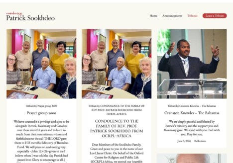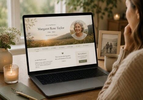

A remembrance website can become much more than an online announcement. Designed with care, it offers a lasting place where photographs, stories, dates and small details can remain together, ready for relatives and friends to return to when they need them. Good Remembrance Website Design recognises that grief is personal and that every visitor may approach a memorial at a different pace. The experience should therefore feel calm, welcoming and easy to use, rather than crowded with features or driven by urgency.
The most meaningful memorials often include the ordinary moments that made someone distinctive: a favourite saying, a familiar route, a treasured recipe, a story from childhood or a photograph that was never formally posed. Bringing these fragments together helps a family describe a whole person instead of reducing a life to a single date. It also makes the website useful over time, as new memories can be added by people who were not ready to contribute at the beginning.
Begin with the life behind the memorial
Strong Memorial Web Design starts with listening. Before choosing colours, layouts or galleries, it helps to understand how the family speaks about the person being remembered. Was their life full of humour, quiet kindness, adventure, service, creativity or deep loyalty? Those qualities can guide the tone of the page, the balance of imagery and the amount of space given to written stories.
A clear opening section can introduce the person in a few warm sentences, followed by simple routes to the parts of the memorial that matter most. A biography might sit alongside a timeline, while a gallery can hold both milestone photographs and everyday snapshots. This structure gives visitors an immediate sense of place without asking them to navigate a complicated menu. It also leaves room for the memorial to feel personal rather than like a fixed template.
For families who want to explore the possibilities, designing an online memorial that feels truly personal offers a useful reminder that small choices in language and presentation can shape the entire experience.
Make room for different kinds of memory
Not everyone remembers in the same way. One person may want to write a detailed story, another may prefer to share one photograph, and someone else may simply want a quiet place to read. A thoughtful website makes each kind of participation feel valid. Short contributions, longer recollections, scanned letters, audio recordings and family recipes can all sit within the same wider story when the design gives them a natural home.
It is also worth planning for memories that arrive later. Anniversaries, reunions and conversations between relatives often bring new details to light. A memorial should make it straightforward to add a photograph or story without disturbing the existing arrangement. Clear prompts, consistent formatting and a gentle moderation process help keep the site coherent while preserving the individual voices that make it special.
This shared approach reflects the ideas explored in building a memorial website that families can add to together. The aim is not to create a finished monument that can never change, but a respectful family space that can grow carefully over time.
Design for quiet visits as well as shared occasions
People may visit a remembrance website on a significant anniversary, after hearing a familiar song, or during an ordinary afternoon when they suddenly want to feel close to someone. The design needs to support both public moments and private reflection. Comfortable text sizes, uncluttered pages, thoughtful image spacing and reliable mobile presentation all help the website feel considerate.
Navigation should remain visible without becoming dominant. Visitors should be able to find the life story, photo collection, tribute area and practical details without searching for hidden controls. Colour can establish atmosphere, but contrast still matters because many visitors will read on a phone or tablet. Alt text, descriptive links and sensible headings make the memorial more accessible, allowing more relatives to take part.
A calm visual rhythm is often more powerful than elaborate animation. A page that loads quickly and gives each photograph breathing space can communicate care more effectively than a collection of decorative effects. These principles are also central to the role of simplicity in meaningful memorial web design, especially when the purpose is to help people pause and remember.
Let the memorial remain useful over time
A well-planned remembrance website can serve several generations. Younger relatives may discover family history through the stories and images, while older visitors may value a familiar place where names and relationships are kept together. Including dates, locations and brief context helps future readers understand the connections between people, even when they did not know the person in life.
It is sensible to agree who will look after the website and how new contributions will be reviewed. A small group of trusted family members can help preserve privacy, correct details and keep the tone consistent. Regularly checking that images display properly and that important pages remain easy to reach is part of caring for the memorial, but the process should stay simple enough to continue without becoming a burden.
The best Remembrance Website Design feels unobtrusive. It gives memories a clear home, welcomes many forms of contribution and respects the changing needs of a family. When the technology stays in the background, the people and stories remain at the centre. That is what makes a memorial website not only beautiful at launch, but meaningful every time someone returns.